The Text cursor replaces the default arrow with your own wording—anything from VIEW, SCROLL, SHOP NOW, DRAG, or branded microcopy—which follows movement (optionally smoothed). This page mirrors the First Cursor Effect walkthrough with the same panels and screenshots, but documents every knob and typical upgrades (including Circular Background Pro).
If you want the shortest path once, open First Cursor Effect first, then circle back here for detail.
When to Use the Text Cursor
| Scenario | Why Text works |
|---|---|
| Clear calls to action near hero or gallery | Readers see literal instruction next to interaction. |
| Creative portfolios or studios | Personality without maintaining image assets yet. |
| Minimal sites | Typography matches your heading font stack vibe when sized and spaced well. |
Switch to Image or Icon when you need glyphs or raster art; stick with Text when the message matters more than the shape.
Across the UI you rely on:
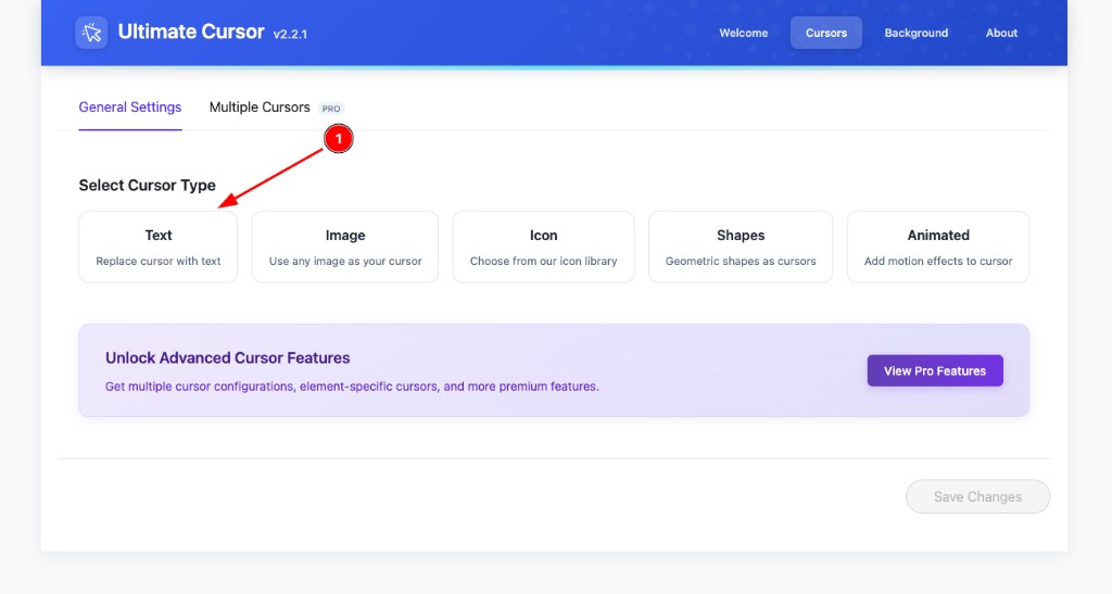
- Header tab Cursors → inner tab General Settings → card Text (Replace cursor with text).
- Block Customize Your Cursor → accordions Cursor Type, Style, Advanced → Preview.
Step 1: Choose Text on General Settings
- Open Ultimate Cursor in WordPress admin.
- Activate the Cursors section in the plugin header (Welcome, Cursors, Background, About, etc.).
- Under General Settings (leave Multiple Cursors unless you already use PRO), click the Text tile.
That sets the plugin’s primary mode to text-based badges.
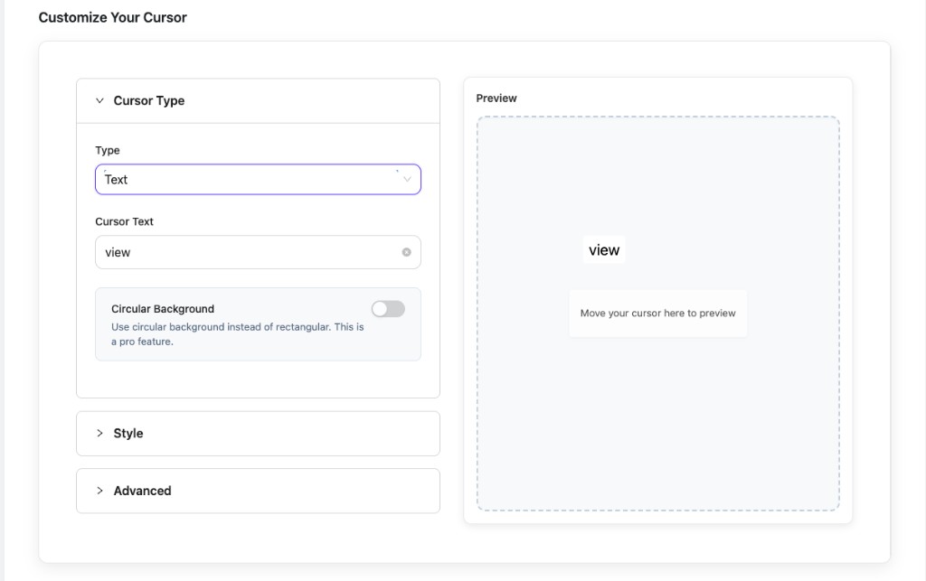
Step 2: Cursor Type Fields and Live Preview
Expand Customize Your Cursor → Cursor Type. Keep Type on Text so it agrees with your card selection.
| Field | Detail |
|---|---|
| Cursor Text | The string drawn next to focus. Prefer short clauses (typically one or two words) so the badge stays legible beside links and thumbnails. Spaces and capitalization pass through literally. |
| Circular Background | Pro feature: badge becomes circular instead of the default rectangular chip. Matches pill-style logos and round buttons; still pair with sizing in Style. |
Always proof in Preview. The dashed pane is labeled Preview—move inside it so internal feedback matches frontend motion.
Step 3: Style Typography Contrast and Borders
Style is where readability is won or lost:
- COLOR — foreground for the glyphs. Aim for WCAG-ish contrast versus BACKGROUND, especially over busy photography.
- BACKGROUND — fill behind letters. Transparent or tinted glass effects depend on browser support—test on light/dark hero sections if you reuse one preset across pages.
- Font Size (px) — readable at arm’s length on desktops; extremes feel playful but can collide with clickable regions (reduce size over dense navigation).
- Spacing Vertical / Horizontal — internal padding similar to chip components; increase if descenders clip, decrease if badges feel floppy.
- Border Style — None for flat UI; bordered presets help separate pastel fills from pastel page backgrounds.
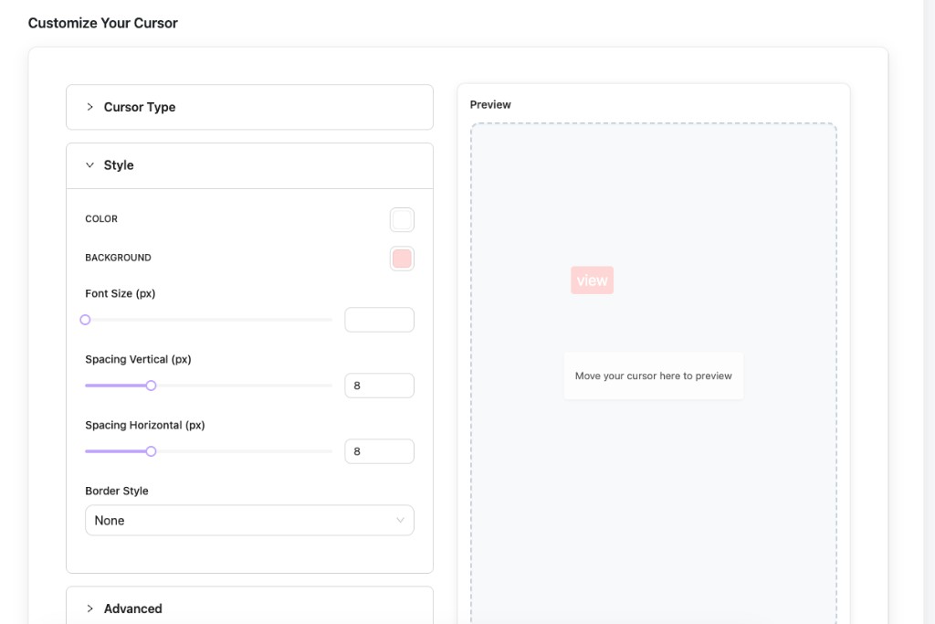
Tweak settings while watching Preview, then skim the storefront on regular and retina viewports.
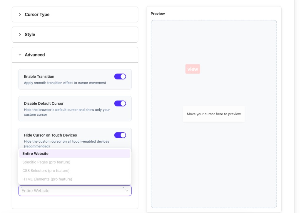
Step 4: Advanced Motion Default Pointer and Scope
| Control | Recommendation |
|---|---|
| Enable Transition | Keeps trailing smooth; disable if you crave instant lock (rare). |
| Disable Default Cursor | On for full branding; leave room for usability testing—some users dislike losing the arrow over inputs. |
| Hide Cursor on Touch Devices | Leave On unless you purposely experiment; thumbs do not hover. |
Targeting options under the accordion stack:
- Entire Website — baseline for prototypes.
- Specific Pages, CSS Selectors, HTML Elements — Pro-scoped granularity when you graduate from one global slogan.
Those Pro rows appear grey/disabled until the license exposes them alongside Multiple Cursors.
Step 5: Save Test and Fix Common Text Issues
- Tap Save Changes after edits (button stays muted until deltas exist).
- Hard-refresh frontend with devtools open to bypass aggressive caching layers.
| Symptom | Things to verify |
|---|---|
| Text clipped | Increase Spacing or shrink Font Size. |
| Invisible badge | Punch up COLOR vs BACKGROUND; inspect overlapping z-index-heavy themes (rare). |
| Arrow still appears | Toggle Disable Default Cursor and confirm script not blocked by optimization plugins. |
| Works in admin preview only | Check scope dropdown; ensure Entire Website applies or Pro rules include the slug you test. |
Labels Multilingual and Accessibility Notes
- Translation plugins — mirror your Cursor Text per locale if you serve multiple languages; static English on a Spanish page feels broken.
- Motion sensitivity — smooth transitions are subtle, but pair with theme-level
prefers-reduced-motionawareness if editors add extra JS elsewhere. - Keyboard users — custom cursors are pointer-centric; do not rely on text badges as the sole instruction for keyboard-only workflows.
- Upgrade path — when typography alone is insufficient, Particle Effects or Hover Effects layer motion without swapping away from Text.
For integration questions, skim Conditional Logic once you coordinate page-specific presets.
Need help? Open Common Issues or contact WPXERO support.