By the end of this page, your cursor will visibly react when it hovers over buttons, links, and any custom elements you choose.
Applies to Ultimate Cursor Pro 2.0.0+.
This is a Pro feature
PRO Interactive Hover is part of Ultimate Cursor Pro. Since 2.5.0 the free dashboard shows only the controls it offers, so this section appears under Customize Your Cursor → Hover once Pro is active and licensed.
Fields
| Field | Type | Default | Purpose |
|---|---|---|---|
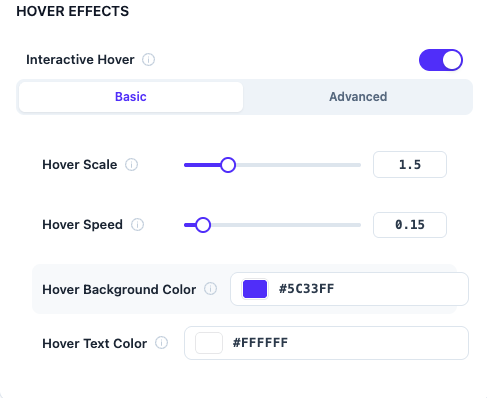
hoverEnabled | bool | on (once unlocked) | master toggle |
hoverScale | number | 1.5 | how much the cursor scales up on hover |
hoverSpeed | number | 0.15 | transition speed into the hover state |
hoverColor | color | #5C33FF | recolor while hovering |
hoverTextColor | color | #FFFFFF | color for hover labels |
hoverGlowColor | color | #5C33FF | glow effect color |
hoverGlowSize | number | 0 | glow radius |
hoverMagneticStrength | number | 0 | pulls the cursor toward the hovered element's center |
hoverLabelsEnabled | bool | off | show text labels like "Open" / "Play" / "Type" on hover |
hoverBlendMode | enum | normal | CSS mix-blend-mode for the hover state |
Which elements trigger it
Hover detection is intentionally broad — it targets interactive elements across the page automatically. It explicitly never triggers on [disabled] or [aria-disabled="true"] elements, so disabled buttons don't visually invite a click they can't accept.
Custom selectors
hoverCustomSelectors lets you add your own CSS selectors to the hover trigger list, for elements the automatic detection doesn't already cover (e.g. custom interactive widgets). Invalid selectors are safely ignored rather than breaking the page.