By the end of this page, a clean geometric shape will be tracking your mouse instead of the default arrow.
Applies to Ultimate Cursor 2.3.1+.
When to use Shapes
Shapes keep the interface lightweight — a solid circle or square is often enough to signal "this is a custom cursor" without the weight of an image or the specificity of text. Good for minimal, modern sites.
Choosing a shape
- Choose the Shapes card under General Settings → Select Cursor Type.
- Open Customize Your Cursor → Cursor Type.
- Browse the shape gallery. Shapes 1–5 are free; shapes 6–25 show a Pro lock badge.
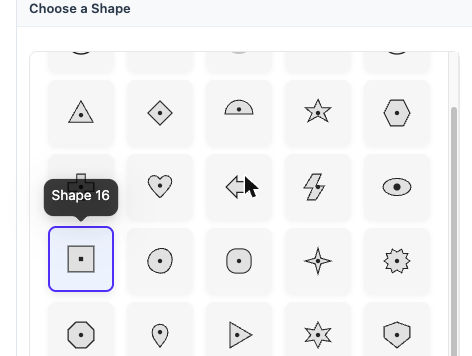
PRO Shapes 6–25 unlock immediately once your license is active — no need to re-pick a shape.
Size, color, and border
| Field | Type | Default | Notes |
|---|---|---|---|
shapeSize | number | 10 | scales the shape |
shapeColor | color | — | fill color |
| Border style | enum | none | one of none, solid, dotted, dashed, double, groove |
| Border width / color | number / color | — | applies when a border style is set |
Save & preview
Click Save Changes and check the live preview, then verify on the frontend. If the shape looks stretched or off-center, double-check shapeSize — very large values can visually clip near screen edges depending on your theme's cursor offset handling.